Using PostgreSQL Aggregate Functions in YugabyteDB to Analyze COVID-19 Data
December 1, 2020
YugabyteDB is an open source, high-performance distributed SQL database built on a scalable and fault-tolerant design inspired by Google Spanner. YugabyteDB uses its own special distributed document store called DocDB. But it provides SQL and stored procedure functionality by re-using the “upper half” of the standard PostgreSQL source code. This is explained in the two part blog post “Distributed PostgreSQL on a Google Spanner Architecture”: (1) Storage Layer; and (2) Query Layer.
An article in the Washington Post, published on 23-Oct-2020 argues the case for wearing a mask while the COVID-19 pandemic continues and refers to data from Carnegie Mellon’s COVIDcast, an academic project tracking real-time coronavirus statistics. Look for this:
There’s a simple statistical measure of correlation intensity called “R-squared,” which goes from zero (absolutely no relationship between the two variables) to 1 (the variables move perfectly in [linear] tandem). The “R-squared” of CovidCast’s mask and symptom data is 0.73, meaning that you can predict about 73 percent of the variability in state-level COVID-19 symptom prevalence simply by knowing how often people wear their masks.
The “R-squared” measure is implemented in YugabyteDB as the YSQL aggregate function regr_r2(). YugabyteDB inherits this, along with about forty other aggregate functions from PostgreSQL. This is just a part of the bigger picture, brought by the decision that Yugabyte engineers made to reuse the PostgreSQL C code for SQL processing “as is” and to wire it up to YugabyteDB’s distributed storage layer.
The COVIDcast site includes this note:
We are happy for you to use this data in products and publications. Please acknowledge us as a source: Data from Delphi COVIDcast, covidcast.cmu.edu.
Not long before I read the Washington Post article, I had just completed writing the section on aggregate functions in the YugabyteDB YSQL documentation. I decided that it would be useful to add a new subsection, “ Linear regression analysis of COVID data from Carnegie Mellon’s COVIDcast project”. The page has a link to a zip-file that contains all the code, together with the downloaded COVIDcast data that the use case account relies on.
This blog post summarizes my account of that use case, and follows its organization.
Overview of the account of the COVIDcast use case in the YSQL documentation
The account has two distinct parts.
The first part
The first part is covered by the sections Finding and downloading the COVIDcast data and Ingesting, checking, and combining the COVIDcast data. It explains how to ingest the downloaded COVIDcast data into a single “covidcast_fb_survey_results” table upon which various analysis queries can be run. The table has this structure:
survey_date                 date     not null } primary
state                       text     not null }   key
mask_wearing_pct            numeric  not null
mask_wearing_stderr         numeric  not null
mask_wearing_sample_size    integer  not null
symptoms_pct                numeric  not null
symptoms_stderr             numeric  not null
symptoms_sample_size        integer  not null
cmnty_symptoms_pct          numeric  not null
cmnty_symptoms_stderr       numeric  not null
cmnty_symptoms_sample_size  integer  not null
“mask_wearing_pct”, “symptoms_pct”, and “cmnty_symptoms_pct” are explained in the section “Finding and downloading the COVIDcast data”, below.
If your interest is limited to how to use the YSQL functions for linear regression analysis, and how to understand the values that they return, you can skip the whole of this first part, simply accept the table as the starting point (taking the column names to have self-evident meanings), and start reading at the section Using the YSQL linear regression analysis functions on the COVIDcast data.
However, the considerations that this part explains, and the SQL techniques that are used to establish that the data that you import into the “covidcast_fb_survey_results” table meet the rules that the COVIDcast site documents, are interesting in their own right, independently of how the ingested data eventually will be used. A time-honored principle of proper practice insists that when you ingest data from a third-party provider, especially when you have no formalized relationship with this party, you must run stringent QA tests on every successive ingestion run. Interestingly, by starting with a real goal and by implementing appropriate solutions, I found myself using various techniques that I had recently documented. For example, in an earlier exercise, I had documented the YSQL features that implement the functionality of the array data type. My QA code uses the array[] constructor, the array_agg() function, and the FOREACH construct to iterate over the elements in an array.
The second part
The second part is covered by the section Using the YSQL linear regression analysis functions on the COVIDcast data. It explains the analysis and shows how to produce values and graphs like those that the Washington Post article presents.
The central query uses regr_r2() (the function that implements the “R-squared” measure), regr_slope(), and regr_intercept().
- The values returned by
regr_slope()andregr_intercept()parameterize the “y = m*x + c” straight line that best fits the data.
- The value returned by
regr_r2()estimates how much of the dependence of the putative dependent variable upon the putative independent variable is explained by the fitted “y = m*x + c” linear relationship. A value of 1.0 is returned when all of the data points exactly lie on the fitted line—in other words, that 100% of the dependency is explained by the linear relationship. Values less than 1.0 mean that the points don’t all fall on the fitted line and that the reason that they don’t is unexplained. A value greater than or equal to 0.6 (in other words that 40% of the relationship is unexplained by a linear rule) is generally taken to indicate that there is indeed a real correlation between the putative dependent variable and the putative independent variable.
The analysis uses “cmnty_symptoms_pct” (the putative dependent variable) as the first actual and “mask_wearing_pct” (the putative independent variable) as the second actual in a SELECT statement that uses GROUP BY with the “survey_date” column as its argument. This produces a row for each survey date that shows the slope and intercept on the “cmnty_symptoms_pct” axis of the straight line that best fits the 51 “(cmnty_symptoms_pct, mask_wearing_pct)” tuples—one for each state. (DC is included as a state in the COVIDcast scheme.) And it shows this line superimposed on the scatter-plot of these 51 tuples for an arbitrarily selected single day. Naturally, other aggregate functions like avg(), max(), and min() come into play.
Finding and downloading the COVIDcast data
The account of the COVIDcast use case starts by explaining how to find and download the COVIDcast data. The high level point is that the COVIDcast site makes all kinds of data available for download. Some kinds are exposed using ordinary comma-separated files—hereinafter .csv files. Other kinds are exposed via APIs. The .csv files are easiest to consume. And these files provide data that sufficiently show how to do linear regression analysis on values stored in database table(s). The APIs give you access to data collected using more robust methods than were used to populate the .csv files. But the aggregate function case study’s pedagogy doesn’t need this. Therefore, the account’s first section needs only to show how to download these three files:
covidcast-fb-survey-smoothed_wearing_mask-2020-09-13-to-2020-11-01.csv
covidcast-fb-survey-smoothed_cli-2020-09-13-to-2020-11-01.csv
covidcast-fb-survey-smoothed_hh_cmnty_cli-2020-09-13-to-2020-11-01.csv
The naming convention is obvious:
- “2020-09-13-to-2020-11-01” expresses the fact that you chose to download data for the range 13-Sep-2020 through 1-Nov-2020.
- “fb-survey” expresses the fact that you chose to download data collected by a survey implemented through Facebook.
- “smoothed” expresses the fact that the values for each survey date for each state reflect a seven-day trailing average.
- “wearing_mask” is the putative independent variable. It expresses the percentage of respondents who answered “yes” to the question “Do you wear a mask most or all of the time while in public?”
- “cli” is one putative dependent variable. It expresses the percentage of respondents who answered “yes” to the question “Are you suffering from COVID-like symptoms?”
- “hh_cmnty_cli” is another putative dependent variable. It expresses the percentage of respondents who answered “yes” to the question “Do you know someone in your local community with COVID-like symptoms?”
The case study’s pedagogic aim is satisfied by using just one putative dependent variable; “hh_cmnty_cli” was used because it’s this that the Washington Post article uses. The “cli” file is downloaded and ingested into the database, as well, to allow the reader scope for their own further analyses.
Ingesting, checking, and combining the COVIDcast data
This section is split into four subsections:
Inspect the COVIDcast .csv files asks you to look at the downloaded .csv files and to understand what you see with reference to the explanations given on the COVIDcast site.
Copy each of the COVIDcast data .csv files to a dedicated staging table shows you how to use the \copy metacomand in ysqlsh to ingest the downloaded files “as is”. The downloaded values are now exposed for ad hoc SQL querying.
Check that the values from the .csv files do indeed conform to the stated rules shows how to create a procedure that uses the PL/pgSQL assert construct. The teaching value of this section is not so much its COVIDcast specificity as it is the use of a range of SQL techniques. For example, it uses various aggregate functions implemented in dynamically constructed SELECT statements, issued as dynamic SQL, array functionality, date arithmetic, and the assert construct itself. This means that should an assumed rule not hold, the ingestion flow simply aborts rather than blundering on (which would lead, ultimately, to meaningless analysis results). Here’s how the abort is implemented:
do $body$
begin
  call assert_assumptions_ok(
    start_survey_date => to_date('2020-09-13', 'yyyy-mm-dd'),
    end_survey_date   => to_date('2020-11-01', 'yyyy-mm-dd'));
  call xform_to_covidcast_fb_survey_results();
end;
$body$;
The “assert_assumptions_ok()” procedure is parametrized by the start and end dates for the downloaded range so that it can check that every date from the start through the end is present.
Join the staged COVIDcast data into the “covidcast_fb_survey_results” table shows how to join the values from the three staging tables, using the primary key “(survey_date, state)”, into a single table that will support the linear regression analysis.
The code that implements these sections is interesting because of the need to use the same operations on each of the three identically structured staging tables. This is a canonical case for dynamic SQL using “template” SQL statements whose table names are substituted, iteratively, at run time. It is natural, and easy, to implement this scheme in PL/pgSQL stored procedures.
Using the YSQL linear regression analysis functions on the COVIDcast data
This view is defined to focus attention on the columns from the “covidcast_fb_survey_results” table that the analysis uses:
create or replace view covidcast_fb_survey_results_v as
select
  survey_date,
  state,
  mask_wearing_pct,
  cmnty_symptoms_pct as symptoms_pct
from covidcast_fb_survey_results;
This section has three subsections.
Daily values for regr_r2(), regr_slope(), regr_intercept() for symptoms vs mask-wearing — here
This query implements the semantic essence:
select
                                                    survey_date,
  regr_r2       (symptoms_pct, mask_wearing_pct) as r2,
  regr_slope    (symptoms_pct, mask_wearing_pct) as s,
  regr_intercept(symptoms_pct, mask_wearing_pct) as i
from covidcast_fb_survey_results_v
group by survey_date
order by survey_date;
The actual query defines this core SELECT substatement in a WITH clause and adds formatting code in its final part. Here are a few result rows from the middle of the range:
 survey_date |  r2   |   s   |   i
-------------+-------+-------+--------
 ...
 09/28       |  0.66 |  -0.8 |   91.8
 09/29       |  0.69 |  -0.9 |   95.5
 09/30       |  0.70 |  -0.9 |   99.9
 10/01       |  0.70 |  -0.9 |  100.9
 10/02       |  0.70 |  -0.9 |  101.4
 10/03       |  0.68 |  -0.9 |   99.2
 10/04       |  0.66 |  -0.9 |   97.2
 10/05       |  0.69 |  -0.9 |  102.3
 10/06       |  0.68 |  -0.9 |  103.4
 10/07       |  0.66 |  -0.9 |  103.4
 ...
The regression analysis measures are reasonably steady over the range. This query calculates the average of the daily regr_r2(), regr_slope(), and regr_intercept()results:
with a as (
  select regr_r2 (symptoms_pct, mask_wearing_pct) as r2,
  regr_slope    (symptoms_pct, mask_wearing_pct) as s,
  regr_intercept(symptoms_pct, mask_wearing_pct) as i
  from covidcast_fb_survey_results_v
  group by survey_date)
select
  to_char(avg(r2), '0.99') as "avg(R-squared)",
  to_char(avg(s), '0.99') as "avg(s)",
  to_char(avg(i), '990.99') as "avg(i)"
from a;
This is the result:
 avg(R-squared) | avg(s) | avg(i)
----------------+--------+---------
  0.63          | -0.97  |  105.59
The resulting average value for “R-squared” of 0.63 indicates that the incidence of COVID-like symptoms is indeed correlated with mask-wearing: as mask-wearing goes up, COVID-like symptoms go down.
SELECT the data for COVID-like symptoms vs mask-wearing by state scatter plot — here
This query:
 select
  round(mask_wearing_pct)  as "% wearing mask",
  round(symptoms_pct)      as "% with symptoms",
  state
from covidcast_fb_survey_results_v
where survey_date = to_date('2020-10-21', 'yyyy-mm-dd')
order by 1;
selects out the data for 21-Oct-2020 so that it can be used to draw a scatter-plot. This is the result:
 % wearing mask | % with symptoms | state
----------------+-----------------+-------
             66 |              34 | wy
             71 |              49 | sd
             73 |              46 | nd
             75 |              37 | id
             79 |              32 | ok
             80 |              31 | tn
             80 |              33 | ia
             80 |              29 | ms
             81 |              33 | mo
             81 |              41 | mt
             81 |              31 | ks
             81 |              24 | la
             82 |              36 | ne
             82 |              28 | al
             82 |              23 | ga
             83 |              29 | ak
             84 |              23 | sc
             85 |              33 | ut
             85 |              19 | fl
             86 |              31 | in
             86 |              30 | wv
             86 |              31 | ar
             86 |              23 | oh
             87 |              25 | tx
             87 |              17 | az
             87 |              29 | ky
             88 |              36 | wi
             88 |              20 | nc
             88 |              17 | pa
             88 |              21 | co
             88 |              22 | mi
             89 |              13 | me
             89 |              13 | nh
             89 |              26 | mn
             89 |              24 | il
             89 |              20 | nv
             90 |              21 | nm
             90 |              16 | or
             90 |              19 | va
             91 |              13 | ca
             92 |              16 | ri
             92 |              11 | vt
             92 |              16 | wa
             92 |              13 | nj
             93 |              15 | ct
             93 |              13 | ny
             93 |              15 | de
             94 |              16 | md
             94 |              12 | hi
             95 |              12 | ma
             96 |              12 | dc
This is very similar to the table that the Washington Post article shows. The small differences are explained by the fact that the Washington Post used a COVIDcast API to download more demographically reliable data and that their table is for a different arbitrarily selected date. The overall trend is clear:
- as mask-wearing increases, the incidence of COVID-like symptoms decreases.
Average COVID-like symptoms vs average mask-wearing by state scatter plot for 21-Oct-2020 — here
The dots on the plot below represent “mask_wearing_pct” on the x-axis with “symptoms_pct” on the y-axis. They visualize the results that the previous section shows in tabular form. And the straight line has the slope and y-axis intercept for 21-Oct-2020 from the query shown in the section before that. The plot was created simply by pasting a comma-separated list of data point pairs (produced, of course, by a tailor-made query) into a spreadsheet and by using the app’s built-in functionality to create a scatter plot from such value pairs. Then the plot was printed and the line was drawn in by hand. Here it is:
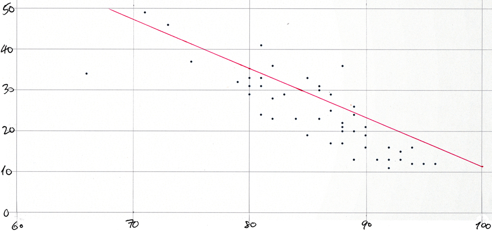
The plot would be too cluttered if each of the 51 points were labeled with its two-letter state abbreviation. The Washington post article shows a very similar plot.
Conclusion
This post has shown you how to use the YSQL functions for linear regression analysis along with a wide range of generic YSQL functionality to implement a study with acute real world relevance. Here is how the page that introduces the case study ends:
The function regr_r2() implements a measure that the literature refers to as “R-squared”. When the “R-squared” value is 0.6, it means that 60% of the relationship of the putative dependent variable (incidence of COVID-like symptoms) to the putative independent variable (mask-wearing) is explained by a simple “y = m*x + c” linear rule—and that the remaining 40% is unexplained. A value greater than about 60% is generally taken to indicate that the putative dependent variable really does depend upon the putative independent variable.
The downloaded COVIDcast data spanned a fifty day period (from 13-Sep-2020 through 1-Nov-2020). The value of “R-squared” was computed, in turn, for each of these days. It was greater than or equal to 60% on about 80% of these days.
This outcome means that empirical evidence supports the claim that wearing a mask does indeed inhibit the spread of COVID.


